
Exploring the Role of Color Psychology in Interior Design
Color psychology plays a fundamental role in shaping our experiences within the spaces we inhabit. Interior design harnesses the emotional and psychological impact of colors to enhance ambiance, influence mood, and define the personality of a home or commercial environment. By understanding how different shades and tones affect human perception, designers can create interiors that evoke specific feelings and support the function of each space. This exploration delves into the nuanced interplay between color selection and the psychological well-being of occupants, offering insight into the science and artistry behind purposeful design choices.
Understanding Color Psychology
Human perception of color results from the way our eyes and brains interpret wavelengths of light. Colors can physically stimulate the body, affecting heart rate, alertness, and even appetite. These biological responses make color selection an impactful aspect of designing spaces meant to energize, soothe, or focus their occupants. Scientific studies have shown that certain colors can elevate mood or promote relaxation, further underscoring the practical application of color psychology in design.
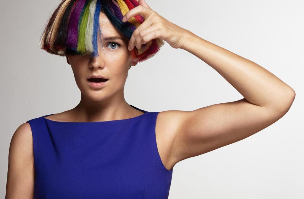
Colors are inherently tied to emotions, often evoking feelings such as calmness, happiness, or excitement. Designers draw on this knowledge to create interiors that resonate emotionally with users. For example, cool blues and greens are commonly associated with relaxation and tranquility, while warm reds and oranges can encourage social interaction or stimulate appetite. Tuning into these emotional cues helps to tailor spaces for their intended psychological effects.
Perceptions of color can vary significantly across different cultures and individuals. What evokes comfort in one setting may induce discomfort in another. Designers must be aware of these differences, considering the cultural background and individual preferences of their clients. Incorporating personal meaning and cultural relevance into color schemes ensures that spaces are not only beautiful but also deeply meaningful for those who inhabit them.
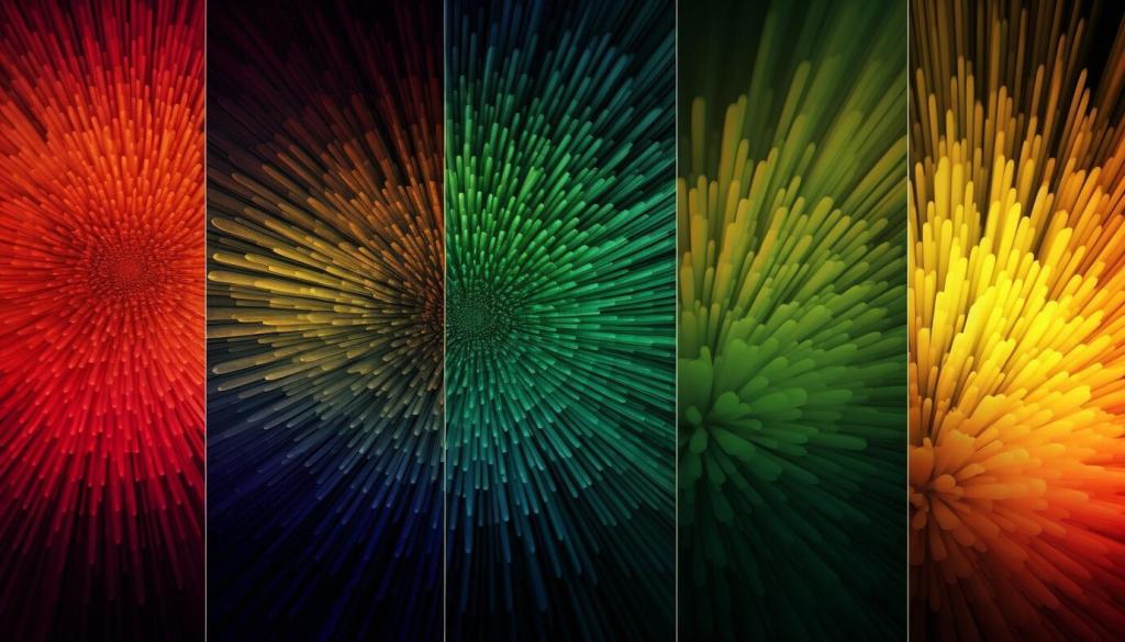
Cool colors such as blues, greens, and violets are commonly utilized to evoke a sense of calm and serenity. These hues slow the mind, lower stress levels, and are therefore ideal for bedrooms, bathrooms, and other areas designed for relaxation. By carefully selecting the appropriate shade and intensity, designers can achieve a tranquil ambiance that supports rest and rejuvenation.
The Functionality of Color in Space
Enhancing Productivity with Strategic Hues
Certain colors have been shown to boost concentration, motivation, and efficiency. For example, soft greens and blues are favored in home offices or study areas because they encourage focus and mental clarity. By considering the intended use of each space, designers can select colors that align with functional objectives, optimizing both comfort and productivity.
Color Associations and Symbolism
Some color meanings are widely accepted—green is linked to nature and renewal, red to passion and excitement, and blue to trust and peace. Interior designers draw upon these universal associations to foster desired emotional responses or convey the intended purpose of a room. Understanding these shared symbols ensures color choices resonate with a broad range of people.
Color Trends in Contemporary Design
Influences on Modern Color Trends
Current color trends are shaped by factors such as global events, shifts in popular culture, and technological advancements. The increased focus on wellness and sustainability, for example, has popularized earthy greens and calming blues. Designers monitor these influences closely to provide clients with designs that feel current yet enduring.
Balancing Timelessness and Trend
While it’s tempting to embrace the latest color fashions, skilled designers strike a balance between trends and timelessness. They may incorporate trendy hues as accents or through easily changeable elements, ensuring that primary color schemes remain classic. This approach allows spaces to feel up-to-date without requiring frequent overhauls or risking premature obsolescence.
The Psychological Impact of Trend Colors
Trend colors often evoke emotions that reflect the cultural zeitgeist. For example, soft pastels may create a sense of comfort during uncertain times, while bold, optimistic shades can inspire hope and renewal. By understanding the psychological undercurrents behind trends, designers use color not just for style, but also to address the collective emotional needs of society at a given time.
Previous
Next
Integrating Color Psychology into Design Projects
The process begins with understanding the client’s personality, preferences, and functional requirements. Designers discuss color likes and dislikes, emotional associations, and practical needs, forming a comprehensive picture that guides color selection. Early attention to psychology ensures the resulting interior is both aesthetically pleasing and emotionally supportive.
Challenges and Considerations
While psychological theories offer general guidelines, color perception is ultimately subjective. What is calming to one person may be unappealing to another. Designers must respect individual preferences, being prepared to adapt even the most well-grounded color recommendations to suit personal taste and emotional reactions.